Brand design is an extensive field of study and one of the main subjects of commercial graphic design, but beyond everyday folks might think, there is a lot of psychology and other sciences behind it.
Mostly, a brand wants to tell us something to move us to do a specific activity. This activity could be buying, sharing, reading, or writing, among other possibilities. However, how they do this is not as easy as it seems.
Brand design fundamentals are a vast topic to review in one single post reason why I am going to be brief about the subjects next discuss.
Feeling the brand and therefore design
The Human brain is continually processing information, stimulus from the world in the form of smells, colors, shapes, sounds that we transform into feelings. Sometimes these perceptions engrave in our memory while others don’t, according to different needs and purposes.
We can define a brand as an organized and designed feeling. Now, there are many ways to conceptualize a brand for marketing or commercial purposes, but in the more profound sense, a brand is no more than a mere sensation with its defined colors and forms, sounds, and even flavors.
Understanding this concept is of incredible value for designers and entrepreneurs, especially when we want to create a logo, packaging, or advertising.
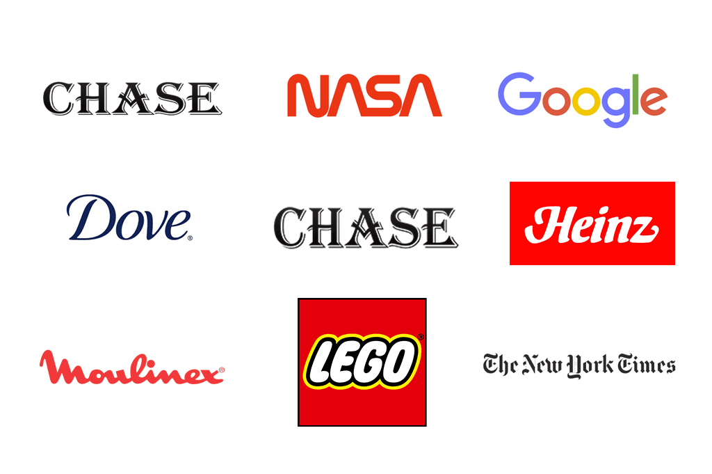
However, as in any other thing in life, there is a limit. Our brains are not willing to preserve the same feeling for too long. The everyday freshness of a brand dissolves with time and daily noise; that is why brands are always changing, trying to keep up with times. Great examples of this are banks and experienced companies such as Coca-Cola, Colgate, LEGO, or Ford
Logos change following cultural and market trends.
In the public sphere, brand design is usually framed under a logo elaboration. Nevertheless, brand design includes a whole philosophy of signs and colors accompanied by dimension and distribution elements, a composition that must be followed and respected by the company if they want to create or preserve its positioning into the consumer’s mind.
Communication
Before we talk about the tools and tips of elaborating a design, we need to know how the brand wants to engage the public
to whom and what we say have an inmense impact on what and how we say it.
In this matter, it is not only about what we say (copywriting) but also how we say it. To this, we must point out that ‘how’ also includes texture, form, and shape. If you add these elements in your creative workshop, your brand design will achieve new heights.
In an earlier paragraph, we talked about designing a feeling; in that sense, we need to address the ‘impact’ as an essential element of brand design.
Impact means that it needs to be disruptive in some way. When we talk about disruptiveness we are not talking about large and expensive campaigns, all the contrary, we need to create something new or at least attempt to it.
It is important not to get discouraged in this regard, thinking our idea is not very original; remember the only one who can say that is the consumer, not the board of directors or our edgy publicist friend.
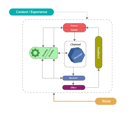
If you study the process of communication, you will see that to get the most fidelity between what the source wants to express to the receptor; it is necessary to avoid noise and use a code that both understand. These codes are known in the advertising world as insights.
It is vital to study and understand the process of communication.
Professionals in marketing need to persuade the consumers into doing something, not only let him know about us but also advised them what they are going to get in return and why they need our product.
That is why advertisers use insights to achieve familiarity and ease the communication dynamics, therefore reducing noise and decoding problems.
Process of communication
These insights must be carefully identified and recollected, in this case, by the advertising team, and as the same word describes it, an ‘insight’ is a behavior into the niche’s mind that includes how a consumer does certain activities and what cultural elements include and make reference in those activities.
For example:
When somebody sucks his fingers after eating a steak with their hands as part of an activity of grilling meat on summer Sundays.
When somebody eats snacks and drink coke during a baseball or football game while sitting on a recliner.
When a couple gets together on a couch at night to watch their favorite show or series while covered in warm blankets.
All these insights help you to project a feeling and recall a texture, a weight, a pace, and timing. Knowing this is the first and most crucial step to create a great brand design and develop a brand identity.
The Design
Once you have your insight and know the purpose of what you want to communicate, you can start designing. This part is where we get technical, and psychology dominates the landscape. Remember that in this post, we are going to explore each one briefly.
We also need to address our competition, but do not let ourselves turn anxious about it and therefore discard our creative ideas following the ‘rival’s trends.’ Our competitors may have a great design and style, but that is not the purpose of our brand but to find our own identity through those tools.
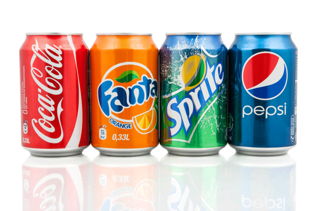
Watching different drinks and their brands can give us an excellent example of how to have a personal identity without falling into crude imitation.
Sodas are very similar to each other, reason companies elaborate brands with different color to appear original.
Typography
The world of design offers many alternatives. A font by itself wants to share its character and style, rhythm, and attitude.
The space between characters, its height, vibrancy, and level of detail will help you to establish a tone. Many times, this is enough to create a brand. By giving a form to the characters of a name you are already projecting a feeling.
Different fonts project different feelings and therefore different reactions.
Now a question comes to our minds: What kind of font should I use? The ones that are thick and flashy or the old style one that can transmit the seriousness of my business? In my opinion: none.
It is one hundred times better if you create your own typography for your product. This decision will give your brand a personal style and will help you to transmit your identity to your consumers.
Psychology of Color
Color has meaning; whether this stays alone against an empty canvas or in contrast with other colors, a hue is a crucial element in brand design and a place for stereotypical concepts.
Many marketers do not consider the impact color could have in a specific culture or social group and miss the opportunity to include it to increase a brand’s punch.
For example, the element of color in food is essential to convey tastiness and freshness, but cultural differences have different reactions to saturation of color and the absence of it.
Which one is the Mexican dish? Color can transmit temperature and even flavor if it is properly used.
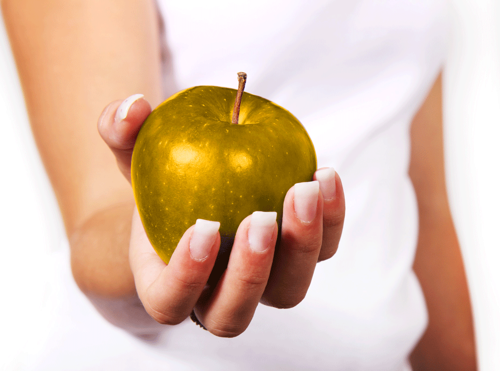
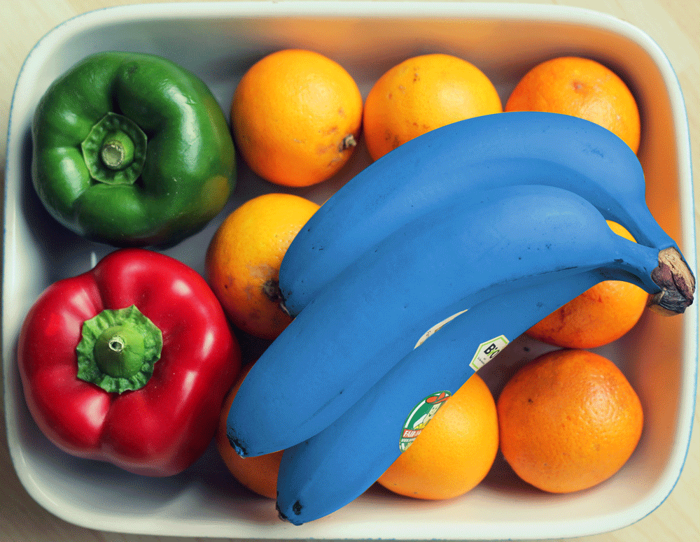
Also, we can achieve a more significant impact with clever use of color, for example, by giving a non-natural hue to things and objects that are commonly known to have a specific color, such as a blue banana, a red pear, yellow clouds, or purple eye.
These contrasts are easy to remember and are used by marketers and creative advertising teams to trigger people’s memory and stimulate positioning.
Color theory: A golden apple and a blue banana produce unespected feelings.
The theory of color is a vast field of study and will take several posts to describe its fundamentals. However, there are some essential aspects a designer needs to know for commercial purposes.
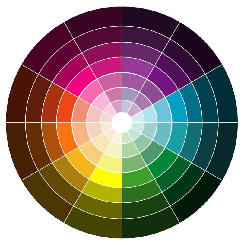
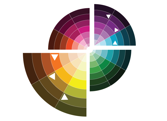
When we talk about color, we must consider the chromatic circle and how specific uses and combinations interact, creating a reaction from the viewer:
Chromatic Circle.
Shade, Tint, and hue
The position a color occupies in a chromatic circumference determines its shade, tint, and hue. If we mix one color with another next to it we will create different shades. In this regard, there are three primary colors we need to recognize before all: red/cyan, yellow, and cyan/blue.
Shade, tint and hue are details that are best used by an expert designer.
Each of these colors can produce the rest of the other shades in the chromatic spectrum, and they are the first stone used to generate emotions in the viewers.
For starters, we only need to consider red transmits warmth, hard feelings, and passion; blue gives us calmness, equilibrium, and immensity, while yellow can recall a mixture of human emotions and vulnerability.
At the same time, red and yellow tend to expand and take protagonism, while blue contracts as if it wants to hide; these are essential points to consider when creating brand design.
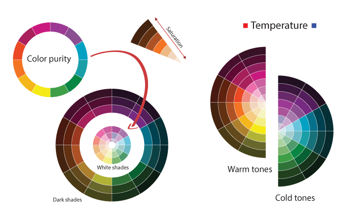
Saturation
Easily confused with luminosity, saturation represents color purity; this is noticeable by the inclusion or absence of another color (shade), white or black. Saturate colors were trendy at the beginning of the ’90s when some companies used them to create their brand designs.
Today, music artists’ and children’s motives include this range of products and advertising.
Remember that when a color is less saturated, it projects neutrality, while when it increases it, we perceive a raw sense of expression.
As you can see in the chromatic circle, there are two different ranges noticeably dominated by a red-yellow spectrum and the blue color.
Appropiate use of color projects different feelings and helps to convey acute messages in advertising.
It depends on the designer which range to use to generate impact. Be mindful that the red-yellowish range transmits proximity to the viewer while the blue one gives you the sensation of distance.
Brand Design and Semiotics in Advertising
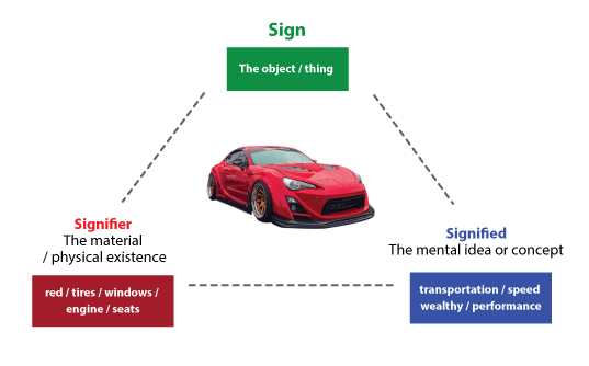
The study of signs, symbols, and its meaning is known as semiotics. As it is happening with color, semiotics includes an immense field of knowledge, which for this blog, we will condense in some essential lines.
Graphic design and other visual communication activities take from semiotics the elements to trigger the mind of the spectators. We can visualize this by considering the famous Saussure triangle’s
Like any other resource used in verbal language, a brand designer can choose to use literary devices to create a brand identity, such as hyperbole, comparison, metaphors, allegories, allusions, among others.
If we use this knowledge of literary devices, and we introduced them into the Saussure triangle, we will have a conceptual idea of what we can use in brand design. This brand design then is applied to all types of collaterals and media elements such as symbols, logos, icons, advertising, dummies, websites, among many others.
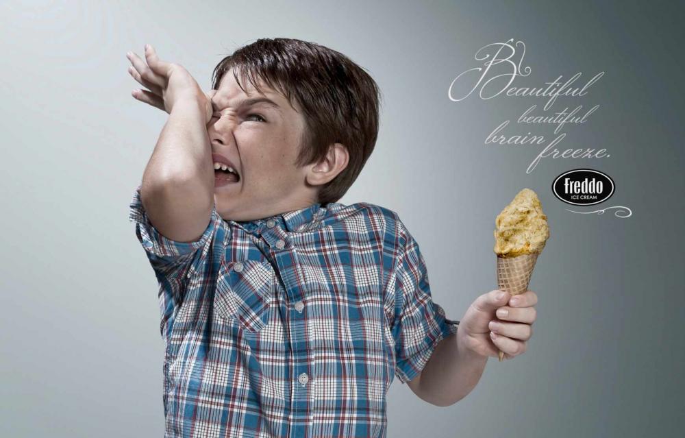
In this ad the colors, tone and texture of the brand can be felt, and therefore its character.
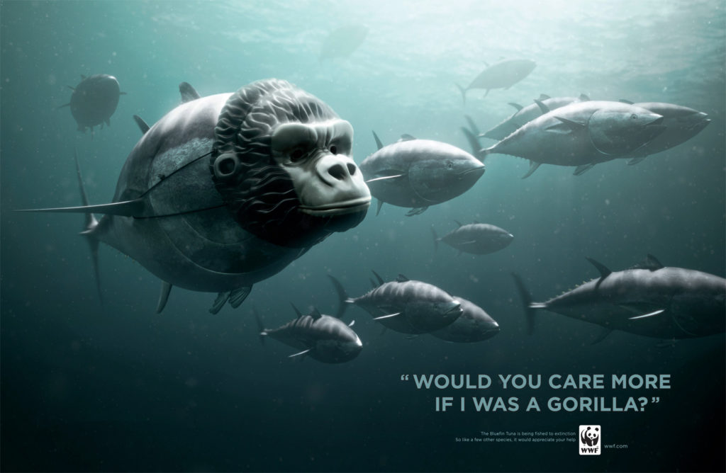
Here we have less familiarity beteween design and the WWF brand. However, there is a clear message.
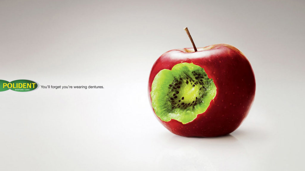
Here the brand colors and the sign send a clear message plus including the same tones and vibrance.
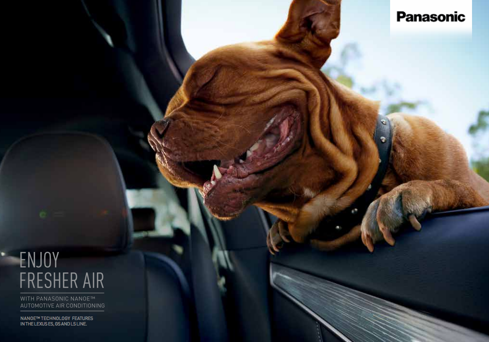
This ad contents a clear and fun message but has no apparent relationship with the brand.
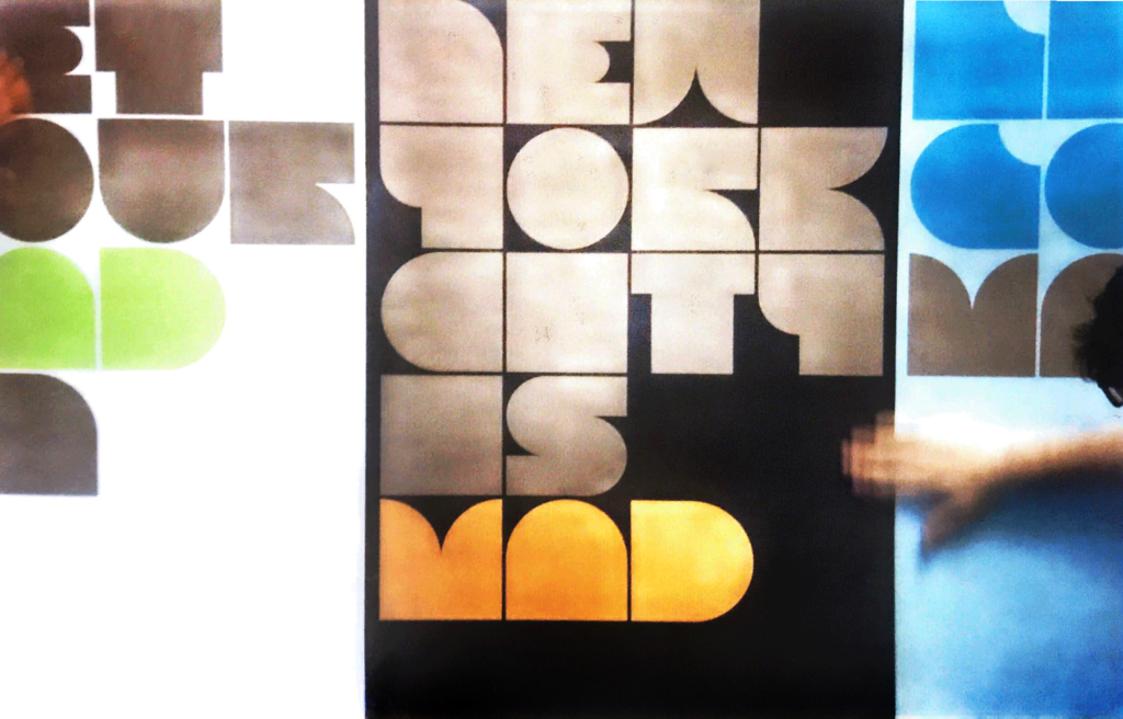
Distribution, reticle, geometrical figures, and rhythm
If you have the insights, the concept, and the colors, you pretty much have 90% of what you need to have a great brand design. However, if the distribution of these elements is not appropriate for your channel or collateral, all your work can become confusing and miss the receptor of the message.
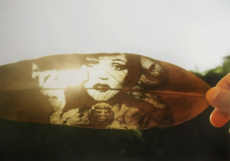
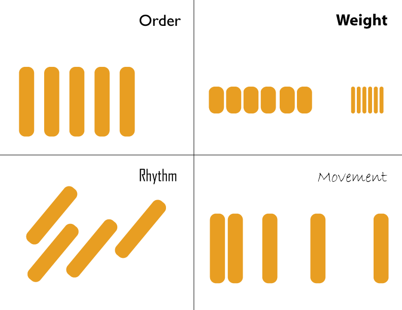
It is here where graphic distribution came into play. First, we need to address how the human brain works and how it perceives order, weight, rhythm, and direction. This subject has a particular relation with differences in light and shape as you can see in this picture.
Altering the space and location between elements in a canvas can project different feelings.
Making an element closer or farther from the viewer, concerning the canvas size, also transmits a message and helps to create specific emotions.
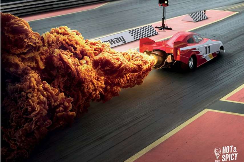
An oversized piece of chiken can allure to portions and the color can do the rest regarding the spiciness.
A detailed ad makes the viewer spend some time perusing the piece. Well use of space in this case is vital.
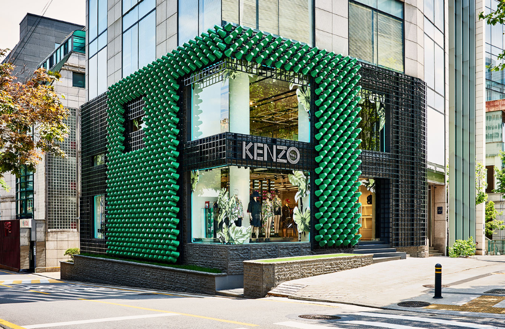
Branding applied to spaces
Finally, we get to the part where brand design applies to architecture. Whether this is in a store, display, showroom, or the company headquarters, a brand design must follow critical elements that interact with human activities and continuously communicate the company values and essence.
Architects, decorators and the marketing department must work together to achieve an equilibrium between the purpose and functionality of the space and the message they want to spread to people or customers.
Building a space for your workers is not going to be designed in the same way a store or a restaurant would be. In this last case, for example, the impact needs to be hyphened; the customer is only going to spend an hour at the most, reason why he needs to take out the most significant memory with him.
On the contrary, if you are going to use branding in your company, you need to be more subtle and create ambiances with less invasive colors that stimulate communication, organization, and probably creativity.
Two examples where brand design is applied into spaces. Both cases project different feelings.
Remember, your brand needs to be present to remind the others they are at a particular place ‘where something (place your brand essence here: great, fresh, vintage, cool, classic) is about to happen.’ If you miss this opportunity to stimulate your audience others will do it while reinforcing their positioning as a result.
Finally, it is vital to highlight the creative element in brand design; however, if you didn’t notice it by now, creativity must be used within limits above explained. Why? Because the purpose of marketing is to satisfy necessities by making people do something (it needs to trigger actions) using our product or service as a medium.
The creative process to achieve a disruptive campaign is complex, and there are no formulas to it, although many will presume of steps or techniques to stimulate creativeness, the right thing to do is to see the market we are aiming to and collect simple items and make them talk with their weight, form, sharpness, smell and other ‘hidden’ characteristics.