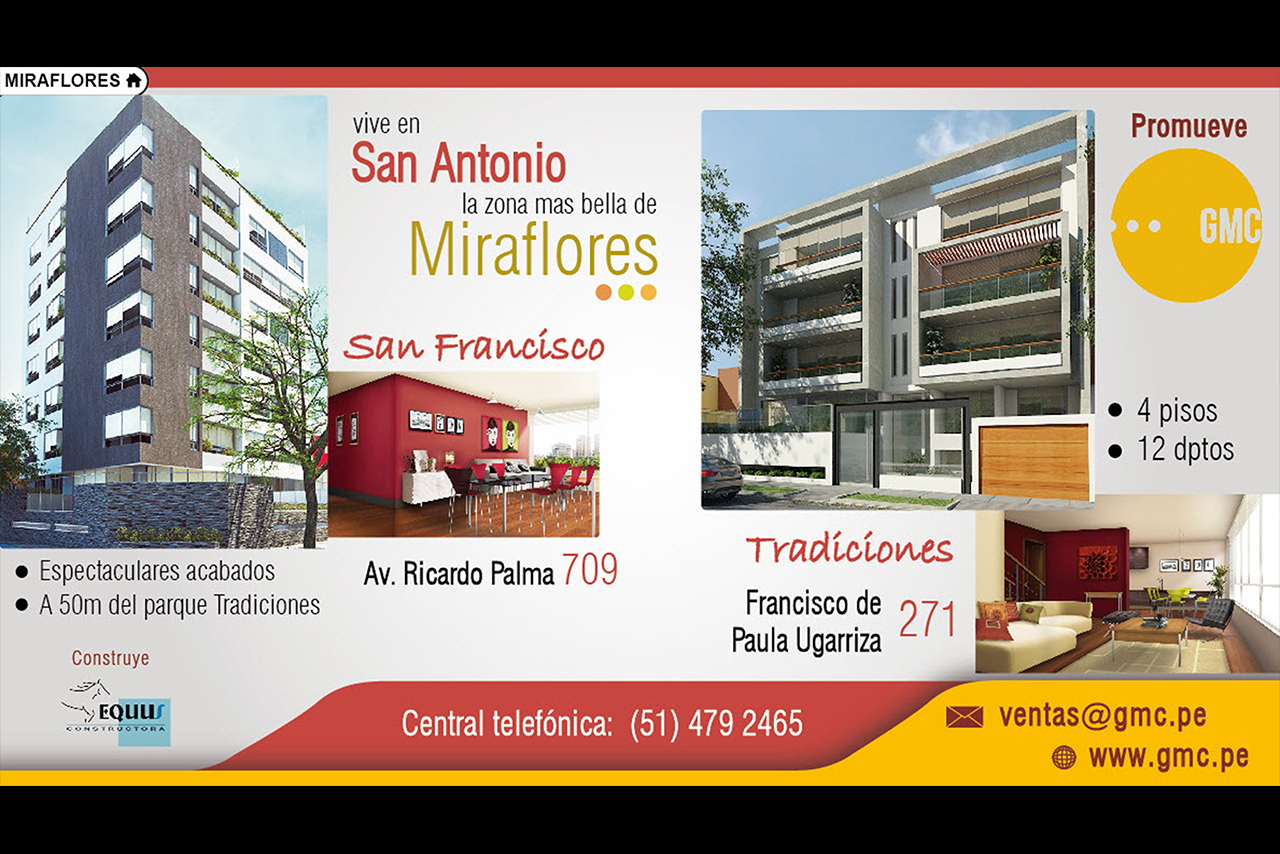
In this graphic design you can see two real estate properties being promoted.
The order was to include the whole addresses, images and a couple of bullet points as description for each building. At the same time, this advert had to include another ‘interior’ picture depicting the corresponding living room.
As consequence, this graphic design required to divide the canvas into two sections and create a layout that allow the viewer to differentiate each project easily.
As you can see, the challenge was to find equilibrium between image sizes and add the contact info, plus the company logo, avoiding disorder.

